test f
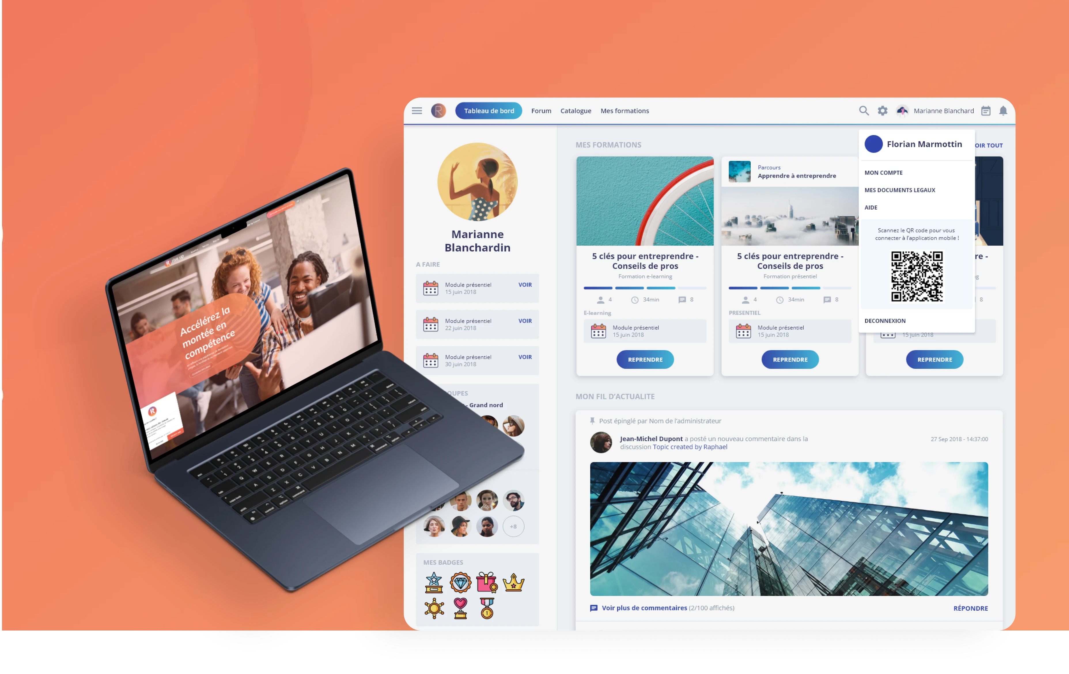
As the first product designer at RiseUp, I was tasked with redesigning the entire platform, which had been originally developed with an outdated interface. My role involved transforming the user experience to create a more modern and intuitive design and describe the companant inside a brand new design system. I focused on enhancing navigation, simplifying access to key features like trainings and certificates, and integrating tools such as the LIA chatbot for user support. I was responsible for all aspects of visual and UX design, including creating illustrations and developing a cohesive visual language. The goal was to increase user engagement, improve mobile accessibility, and provide learners with the motivation and tools needed to succeed in their educational journey.
01
Problem Statement
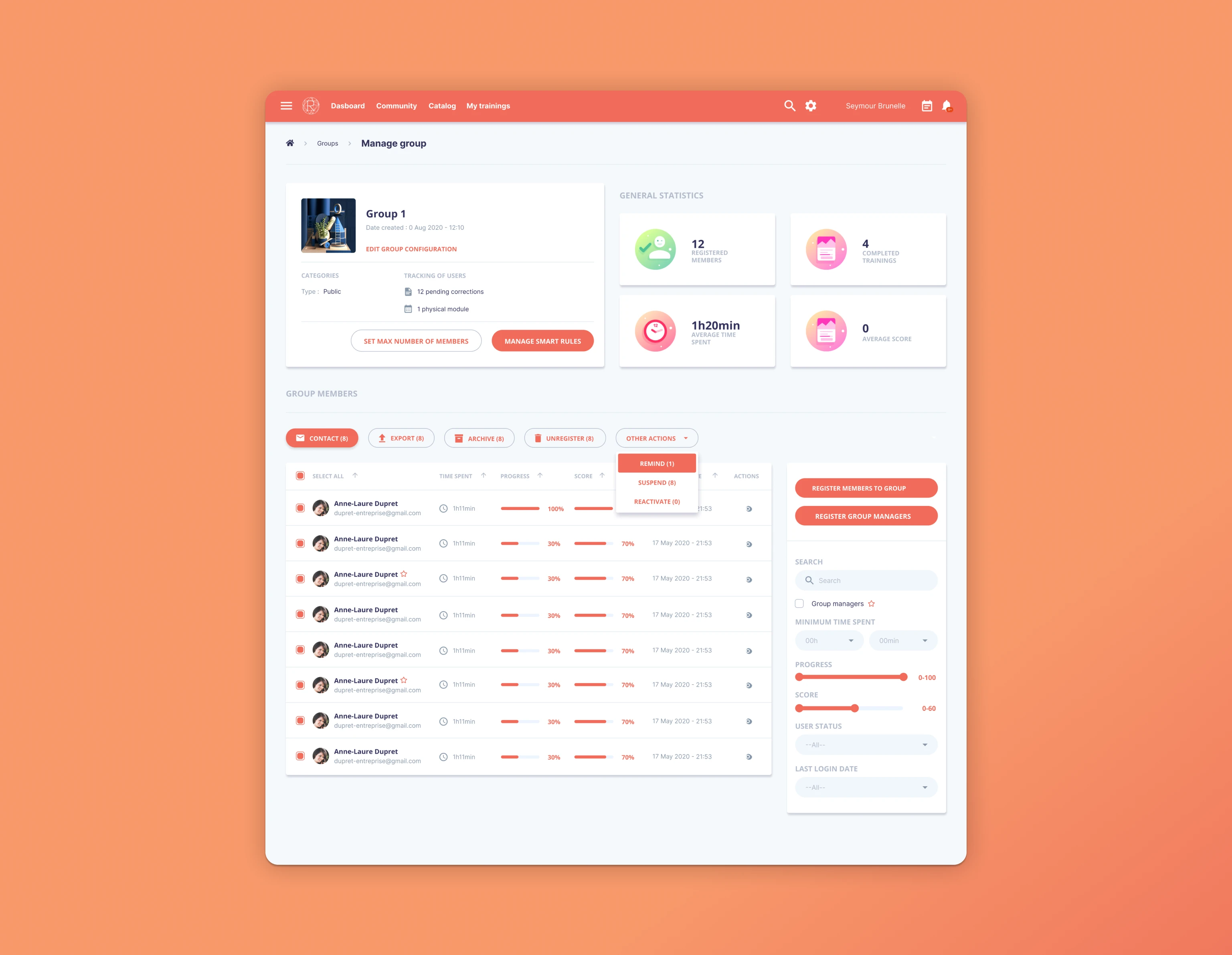
The current RiseUp e-learning platform, built on an outdated project, struggles to engage users effectively due to its cluttered interface, limited access to relevant information, and lack of personalized features. Learners face difficulty in navigating the platform, accessing their training objectives, retrieving certificates, and receiving timely reminders, which negatively impacts user engagement and overall learning outcomes. To address these issues, there is a need to redesign the platform's dashboard, focusing on improving usability, delivering personalized experiences, and integrating tools like the LIA chatbot to enhance the user experience on mobile.
02
User Experience improvments
My approach was informed by comprehensive user research. Through contextual inquiry sessions with 15 learners, we identified key pain points in the dashboard experience, revealing navigation confusion and information overload. Our card sorting exercises helped restructure content based on users' mental models, leading to the streamlined "My Activity" hub.
Usability testing with interactive prototypes validated our gamified interface design, where heat mapping showed increased engagement with progress indicators. A/B testing confirmed that visual feedback loops improved course completion rates by 27%.
For LIA integration, we employed a Jobs-to-be-Done framework to identify moments where learners needed assistance. User journey mapping pinpointed certificate retrieval as a critical friction point on mobile. Our diary studies with 8 participants revealed optimal timing for notifications, which informed LIA's reminder system.
This evidence-based approach, combining qualitative insights from interviews with quantitative data from analytics, ensured our design decisions directly addressed user needs rather than assumptions.

03
User Interface design
The visual design system underwent a comprehensive transformation based on a structured design tokens approach. We migrated from inconsistent static styles to a token-based architecture in ZeroHeight, implementing semantic tokens for color, typography, spacing, and elevation. Our primary color palette was systematically organized with base colors and their variants (e.g., blue-100 through blue-900), each mapped to functional tokens like primary-action, alert-warning, and surface-secondary.
Typography was defined through hierarchical tokens, with text-sm (14px/1.4), text-base (16px/1.5), and heading tokens linked to their respective semantic functions. This allowed designers to reference tokens like "text-success-emphasis" rather than raw hex values, ensuring consistency across the product ecosystem.
Our spacing system followed an 8px baseline grid with multipliers (space-1 through space-8), allowing for predictable component rhythm. Complex UI elements were constructed as compound components in our ZeroHeight documentation, with each atomic element connected to its respective tokens.
For implementation, we exported tokens via Figma Tokens plugin to both CSS variables and Styled Components theme, maintaining a single source of truth. The design system's component library featured 38 reusable elements with comprehensive states, behaviors, and responsive variants, all documented with code snippets and usage guidelines in ZeroHeight.
This token-driven approach reduced "design Spaguetti" while enabling developers to implement new features more efficiently, creating a shared visual language.
Some weaknesses of the RiseUp redesign include the complexity of integrating the LIA chatbot without overwhelming users, the challenge of balancing a simplified interface with the need to display all relevant information, and potential limitations in personalization for users with diverse learning needs. Additionally, the mobile-first design might not fully meet desktop users' expectations, and there may be room for further refinement in gamification to keep learners continuously engaged.

04
Result
The redesigned RiseUp mobile dashboard led to a significant improvement in user engagement. After implementation, user activity increased by 27%, with a 34% rise in session completion rates. The integration of LIA, the chatbot, saw a increase in interaction, particularly for setting reminders and accessing certificates. Push notifications through LIA helped reduce missed sessions. Additionally, the gamified objectives interface contributed to a boost in user retention, as learners found tracking their progress more engaging and motivating.