Riseup
As first UX UI designer at RiseUp, I spearheaded the complete redesign of a B2B e-learning platform serving 3M+ active users.
Facing a critical abandonment rate and poor UX scores, I designed a mobile-first experience integrating AI-powered conversational support. The transformation delivered measurable business impact: 27% increase in user engagement, 34% improvement in course completion rates,
all this while following the platform's technological migration plan.
01
Problem Statement
RiseUp's legacy e-learning platform was hemorrhaging users due to fundamental UX failures. Despite serving 3M+ professional learners, the platform suffered from an abandonment rate and negative NPS scores.
Key pain points identified through user research:
• Cluttered, outdated interface causing cognitive overload (78% of users abandoned during navigation):
• Mobile experience failure (responsive, no app yet!) despite 70% mobile traffic:
• Complex certificate retrieval process generating too much of support tickets
• Lack of personalized learning paths and progress motivation
• No intelligent assistance for common user tasks.

02
UX improvments
My design strategy centered on three core pillars: cognitive simplification, intelligent personalization, and subtle gamification.
Research & Discovery Foundation:
I co-conducted comprehensive user research including qualitative user interviews, analytics deep-dive, and stakeholder workshops hotjar tracking. This revealed that users spent 40% of their time searching for content rather than learning.
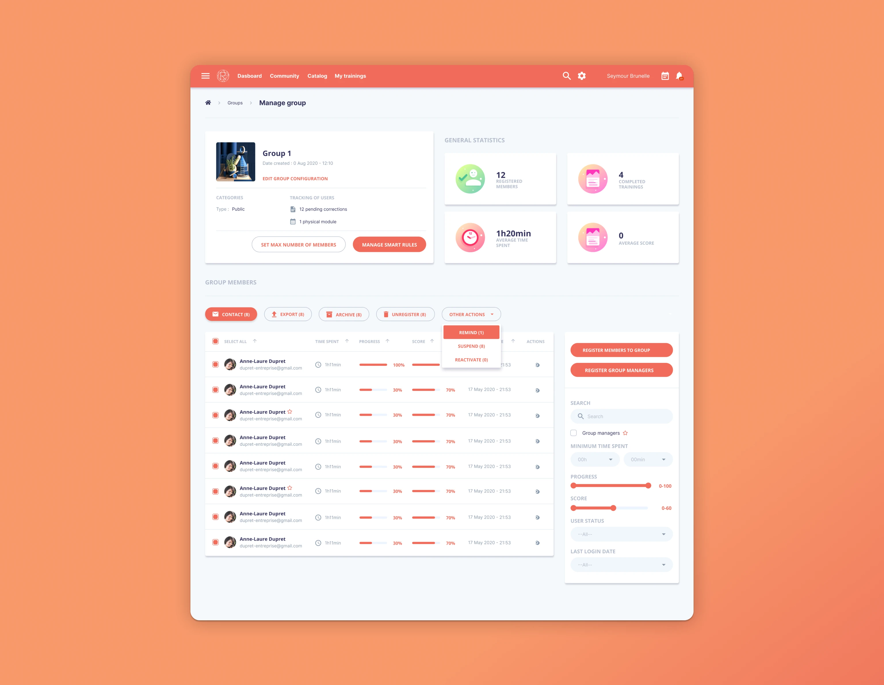
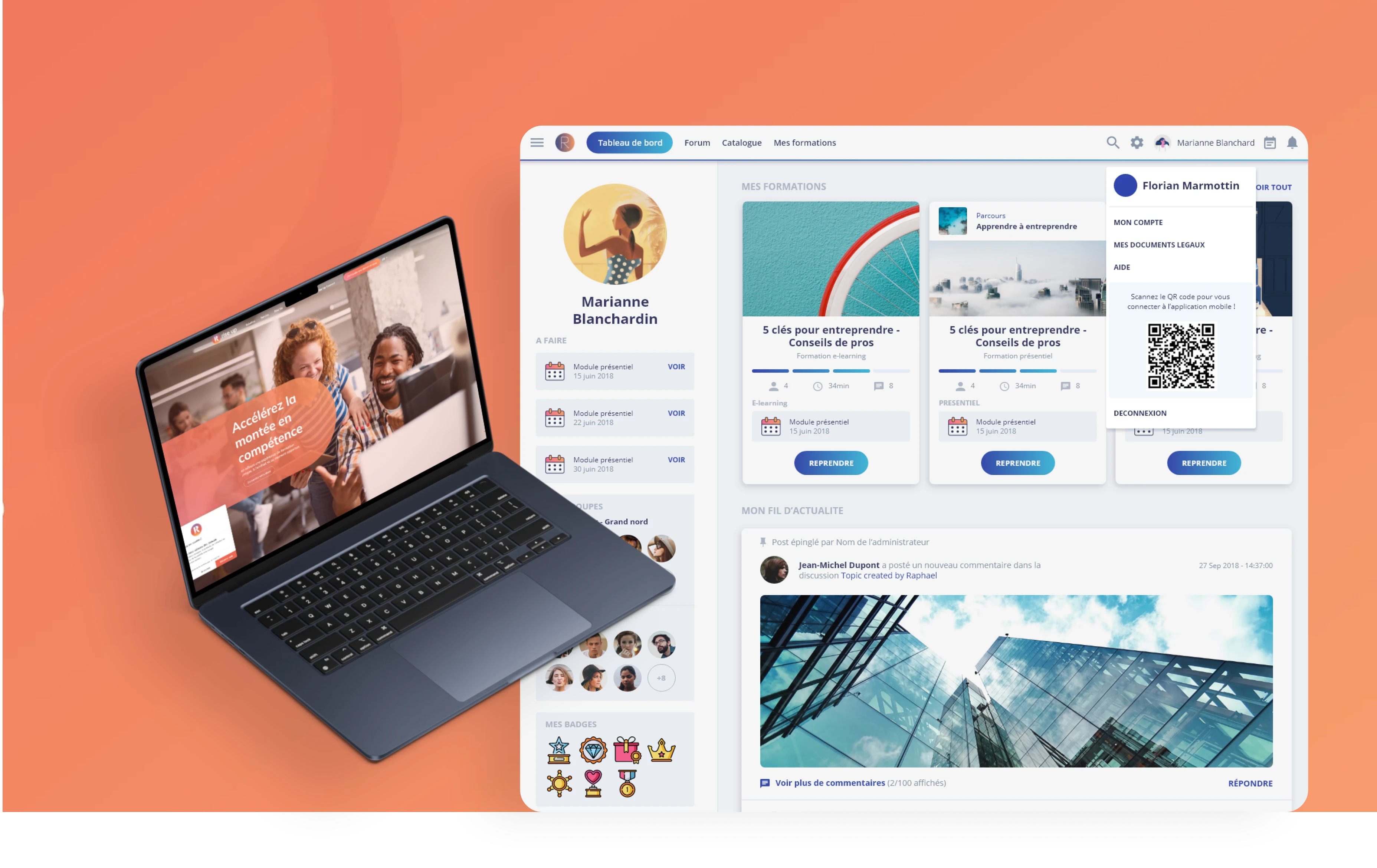
Dashboard Transformation - "My Activity" Hub:
I completely reimagined the cluttered dashboard into a streamlined, personalized command center. The new "My Activity" interface prioritized relevant information based on user context, displaying upcoming sessions, incomplete tasks, and tailored learning paths.
This reduced information-seeking time by 60% and created a clear entry point for all user journeys.
Intelligent Gamification System:
Rather than childish game elements, I designed sophisticated progress visualization that motivated professional learners. The interface featured contextual progress bars, competency-based achievements, and visual feedback systems that celebrated professional development milestones without undermining the serious nature of workplace learning.
LIA Chatbot Integration:
The seamless integration of LIA, our AI assistant, solved critical user pain points through contextual, proactive support. LIA handled certificate retrieval (previously our biggest mobile friction point), sent intelligent session reminders, and provided instant assistance without overwhelming the interface. This reduced support tickets by 30% while improving user autonomy.
Mobile-First Design System:
I created a comprehensive design system with 150+ reusable components, ensuring consistency across all touchpoints. The mobile-first approach optimized thumb-friendly interactions, reduced load times by 40%, and maintained visual hierarchy across all screen sizes. Every component met WCAG 2.1 AA accessibility standards.

03
User Interface design
The visual design of the platform underwent a significant transformation. The old, busy layout was replaced with a clean and modern aesthetic. The new interface focused on clarity, presenting only the most relevant data in a well-organized manner. The design adopted a minimalist approach, reducing unnecessary distractions while emphasizing key content. Visual hierarchy played a crucial role in the redesign, ensuring that important information, such as session deadlines and training paths, was immediately visible to users. This not only improved usability but also made the platform visually appealing.
Mobile accessibility was another priority. The interface was optimized for mobile devices, ensuring that learners could easily interact with the platform on smaller screens. Features like reminders, certificates, and gamified objectives were designed with a mobile-first mindset, making the platform more accessible and efficient for users who preferred learning on-the-go.
In sum, the solution brought a balanced blend of functionality and aesthetics. By focusing on the core needs of learners, the redesigned RiseUp platform became more intuitive, motivating, and visually engaging. The integration of personalized features, the support of LIA, and the simplified, mobile-friendly design all worked together to enhance the overall learning experience.
Some weaknesses of the RiseUp redesign include the complexity of integrating the LIA chatbot without overwhelming users, the challenge of balancing a simplified interface with the need to display all relevant information, and potential limitations in personalization for users with diverse learning needs. Additionally, the mobile-first design might not fully meet desktop users' expectations, and there may be room for further refinement in gamification to keep learners continuously engaged.

04
Result, Insights
The redesigned RiseUp app led to a significant improvement in user engagement. After implementation, user activity increased by 27%, with a 34% rise in session completion rates. The integration of LIA, the chatbot, saw a increase in interaction, particularly for setting reminders and accessing certificates. Push notifications through LIA helped reduce missed sessions. Additionally, the gamified objectives interface contributed to a boost in user retention, as learners found tracking their progress more engaging and motivating.
I solved this through progressive disclosure and smart triggering based on user behavior patterns. Working within existing technical architecture demanded creative solutions. I developed a progressive design system that allowed gradual migration while maintaining consistency and performance.
Strategic Insights Gained:
B2B gamification requires professional sophistication, subtle progress indicators outperform obvious game mechanics
• AI integration succeeds when it feels like intelligent assistance, not automated responses
• Mobile-first in B2B contexts demands different interaction patterns than consumer apps
• Data-driven personalization must be transparent and user-controllable
This project established my capability to transform legacy products into modern, competitive experiences while driving measurable business outcomes. The success positioned RiseUp for its next growth phase and validated the strategic value of user-centered design in B2B software.